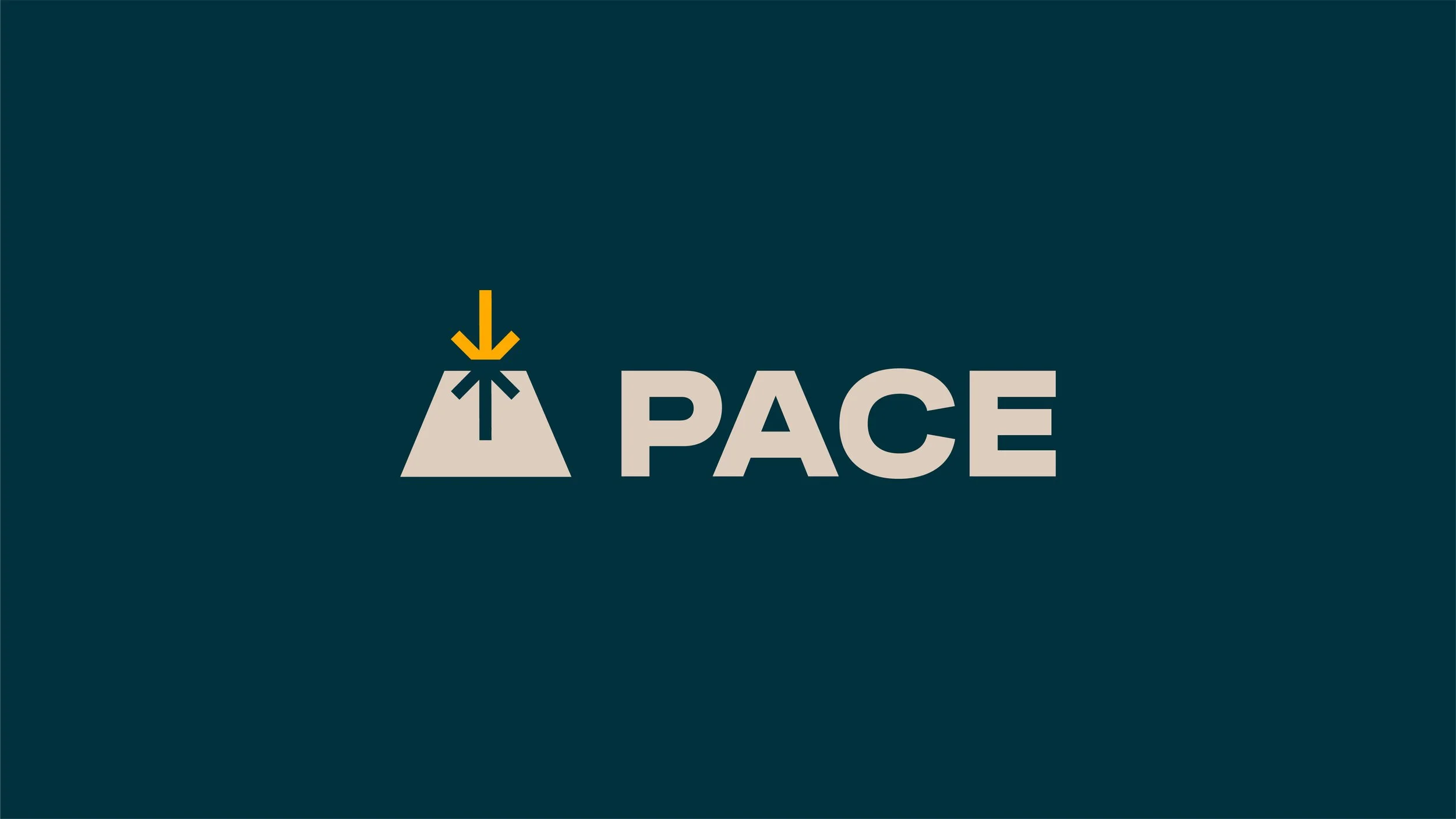
A Path Beyond Engineering Solutions
PACE is an engineering company that focuses on solutions that look past the run of the mill engineering aspect of problem solving. Their commitment to considering real-world conditions and applying their solutions creatively sets them apart as optimizers.
We worked with PACE to create a system that emphasized the union between industrial solutions within the natural world around them. It was essential to keep their keyword—optimizers—in mind while building their brand. The challenge was creating a visual structure that celebrated the team of engineers, surveyors, and other technical professions that PACE was built upon, without feeling stiff or non-creative. In fact, it was essential to show their ability to think outside of the box, reflecting their pride in finding solutions that break the status quo.

The Logo
The PACE logo is structured around 3 basic elements, seen below. The triangle, spark, and path concepts represent different attributes of the brand, and when they come together they form the final mark: a path or mountain top leading to a star or sunrise. This communicates their attitude of always looking forward and upward.
Elements
The design toolkit we created for this brand is made of a culmination of elements that bridge the gap between structure and nature. Structure can be seen in the typographic choices, the patterns based on the shapes and angles within the logo, and the intentionally gridded layouts seen throughout the system, where nature is seen in the natural colors within the palette. The photography used for PACE is a mixture of aerial, scenic, and textural shots that often also show the mix of industry and nature.


Credit also goes out to my amazing team at Turnstyle Studio.


