
Seattle’s community of readers and writers is brought together under one roof.


It started somewhere within the literary roots of Seattle.
Seattle is full of bibliophiles who—especially after a worldwide pandemic—craved to find a community of like-minded literary snobs. Town Hall stepped in to fill in the void of camaraderie one seeks by invited nine both established and up-and-coming writers alike to speak to, sign books for, and meet those literary Seattlites. With plans to make the festival an annual event, they needed a visual system that would catch the eye of passersby, and inspire the word lovers to come listen, learn, and celebrate the literary world.

Scratch that—
The choices in design elements throughout this system all were made with the audience in mind. Caslon is a strong typeface with a long typographic history—especially in book printing. Its usage is meant to call back to the pages of writings that readers love to consume and writers love to create.
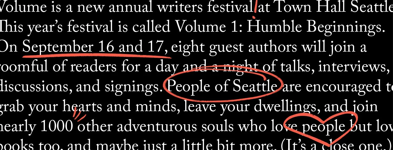
Speaking of readers and writers—many avid members of the former group may like to write notes in the margins of their books, or highlight and underline passages, whereas writers may be used to marking up their manuscripts with and without their editors over and over until it’s ready to print. The scribbled lines inserted into bodies of text, headlines, and illustrations through the system embody that fluctuating nature of literary creation and consumption.


Credit also goes out to my amazing team at Turnstyle Studio.