
Play Without Boundaries
Committed to bringing active, approachable fun to everyone in the PNW, Arena Sports knows one thing: play is essential. Their mission is to surprise and delight their customers, becoming their go-to place to play. They were in search of a visual brand that communicated a feeling of constant, unexpected fun for everyone, and all levels of activity. Offering rock climbing, to soccer leagues, to arcades, to bowling, to ropes courses—so with a diverse audience comes a significant challenge: Show that they are instigators of fun and the place to be.
The Logo
Since Arena already had a strong audience, they wanted their new logo to be an evolution of their original one, as opposed to a revolution. We created a new logotype for them that mimicked the original letterforms, but added some angles and italics to maintain a spirit of movement. Included in the new system was a secondary logomark in the form of a badge or coat of arms, calling reference to their origins: soccer leagues.


The Elements
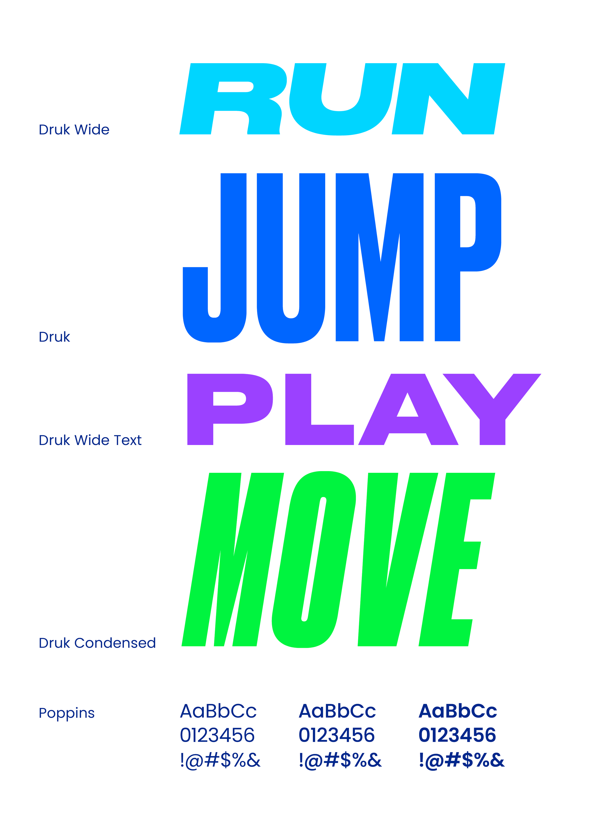
The color and typography chosen for the Arena Sports system is meant to mimic the art of play that is embedded in their mission. Playful colors mixed with dynamic, bold, eye-catching typography helps to fulfill that message. But the champion of the system is known as the Bounce. Designed to mimic the path of a child running through a playground, or a soccer ball bouncing through a field, or a laser tag player darting through a course, the bounce embodies the act of play while acting as a way to brighten compositions throughout the system.


Credit also goes out to my amazing team at Turnstyle Studio.